– why you need to know the difference between leading and lagging economic indicators
Dr Shane Oliver – Head of Investment Strategy and Chief Economist, AMP
Introduction
I reckon many must be confused about the current economic situation. We hear constant talk about how high interest rates and cost of living pressures are causing economic pain for many households, consumer confidence is at recessionary levels and various companies are expressing concern about the economic outlook. But at the same time the unemployment rate remains very low, lots of Australians seem to be holidaying in Europe and restaurants and cafes are doing well. While perplexing, it’s not that unusual at turning points in the economy for various indicators to be conflicting. Much of it comes down to the difference between leading, coincident and lagging economic indicators. This note looks at the differences and why it’s important to allow for them.
Leading versus lagging economic indicators
Economic indicators can be divided based on whether they lead, lag or are coincident with the economic cycle measured by GDP growth. It’s important to be mindful of this when the economy is turning down. The next table lists examples of the most common indicators in each:
-
Leading economic indicators are economic indicators which lead the economic cycle often by 6-18 months. This is because they reflect changes in monetary policy – like the yield curve which is the gap between long term bond yields and short-term interest rates which are a guide to whether monetary policy is tight or loose and money supply growth – or they respond quickly to changes in interest rates – like share markets, confidence and building approvals.
-
Coincident indicators move with the economic cycle, so GDP growth by definition is coincident as are retail sales and household income.
-
Lagging indicators tend to turn after the economic cycle has turned. Unemployment and inflation are lagging indicators because companies are invariably slow to adjust hiring and pricing decisions. They persist with decisions to hire or raise prices after demand has slowed because it takes a while to recognise that any downturn is permanent and turnaround the mechanisms by which they hire and raise prices.
Of course, leads and lags for various indicators may vary for each cycle so it’s often best to focus on an average of them.
Economic indicators
|
Type |
Economic indicator |
|
Leading |
|
|
|
Yield curves |
|
|
Money supply |
|
|
Share prices |
|
|
Building approvals |
|
|
Consumer and business confidence |
|
|
New manufacturing orders |
|
|
Sales to inventory ratio |
|
Coincident |
|
|
|
GDP |
|
|
Retail sales |
|
|
Home building |
|
|
Household income |
|
|
Industrial production |
|
|
Job vacancies |
|
Lagging |
|
|
|
Unemployment |
|
|
Business credit |
|
|
Debt delinquencies/insolvencies |
|
|
Unit labour costs |
|
|
Inflation rate |
Source: AMP
Various organisations publish indexes based on each. For example, the next chart shows indexes of all three produced by the Conference Board. As can be seen the Leading Index (blue line) tends to lead going into downturns/recessions whereas the Lagging Index (red line) follows.
Conference Board US Economic Indicators YoY (%)
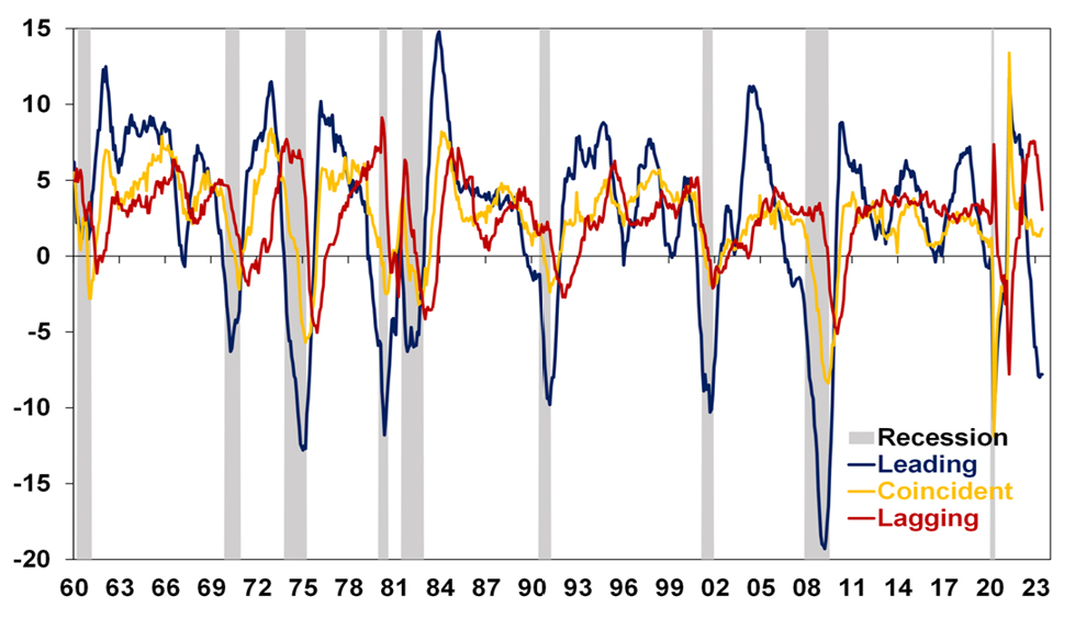
Source: Bloomberg, AMP
Current conditions
And so it is right now in the US with leading indicators depressed, coincident indicators having slowed but still growing and lagging indicators having slowed recently but still around pre-pandemic levels. It’s a similar story in Australia with the Westpac/Melbourne Institute leading index having slowed but GDP growth still positive.
Australia Melbourne Institute Leading Index
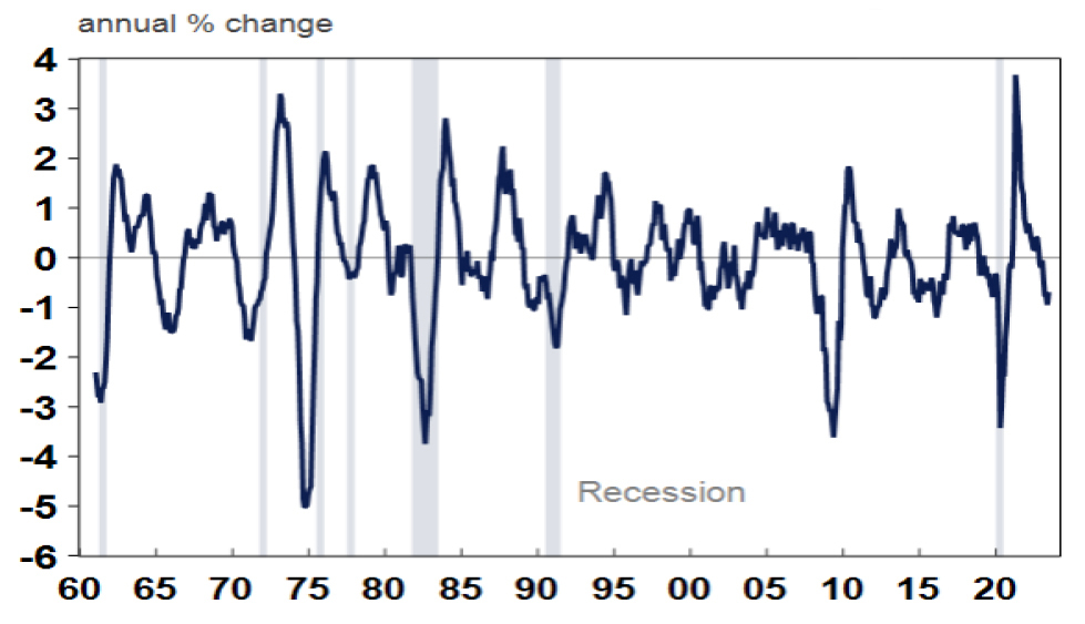
Source: Macrobond, AMP
This is particularly relevant now in relation to unemployment & inflation.
Jobs leading indicators are pointing down
Recent Australian jobs data has been strong with employment up 3%yoy, hours worked up 4.7%yoy and unemployment around a near 50 year low of 3.5%. For much of the last thirty years, Australia has not had a lot of clearly defined economic cycles and unemployment was in a downtrend. The pandemic also distorted normal economic relationships. However, as can be seen in the next chart significant swings in unemployment around the early 1990s recession and the early 2000s and 2008 growth slowdowns saw unemployment tend to lag swings in GDP growth (eg, see the green arrows). This was particularly evident around the early 1990s recession with unemployment still going down as GDP slowed in 1989 and only starting to rise in earnest once the economy was in recession. After the recession ended in mid-1991, unemployment did not peak until late 1992.
Australian Unemployment & GDP Growth
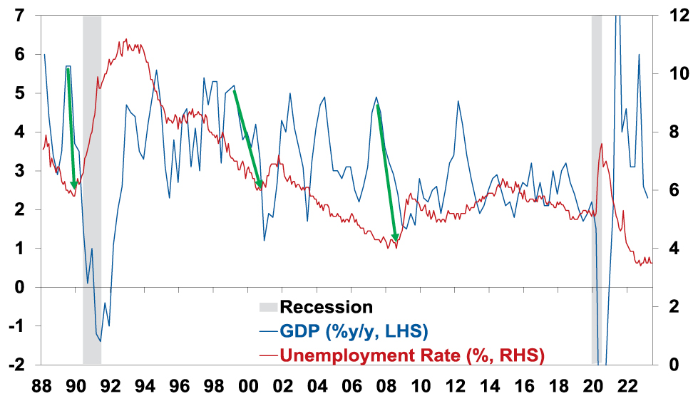
Source: ABS, AMP
Our leading indicator of jobs growth – based on vacancies and hiring plans – points to a sharp slowing in jobs growth ahead.
Australian employment vs Jobs Leading Indicator
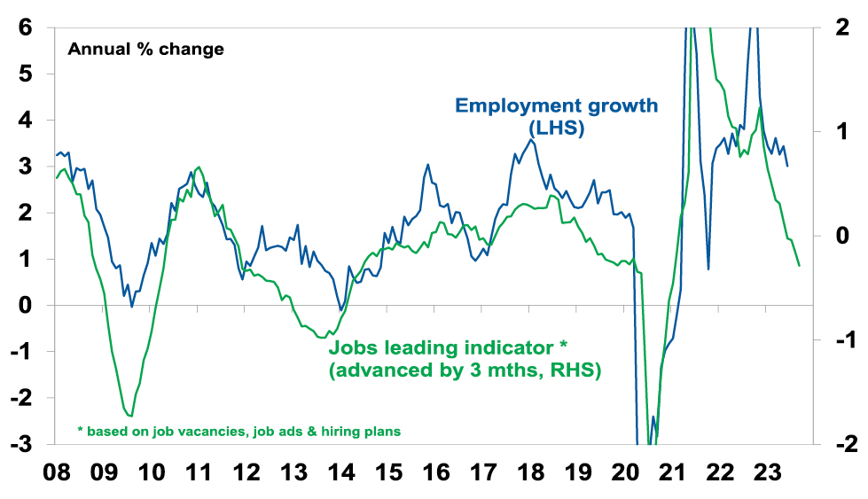
Source: ABS, NAB, ANZ, AMP
Consistent with this, data from Seek shows a rising trend in applications per job ad and consumer surveys also show a rising trend in unemployment expectations which tends to lead the unemployment rate at turning points.
Australia Labour Market Indicators

Source: Macrobond, AMP
On current trends our Jobs Leading Indicator suggests employment growth is likely to fall below the 1% growth the RBA is forecasting over the next year suggesting upside risks to their forecast for a rise in unemployment to 4.5%. Roughly 3% jobs growth now is needed to keep unemployment stable given the surge in population growth with high immigration.
Inflation also lags
As with unemployment, major swings in inflation also tend to lag major swings in GDP growth. Of course, as already noted Australia didn’t have a lot of clear economic cycles over the last 30 years, but the lag was clearly evident in the early 1990s (see the green arrows below). Of course, the pandemic distorted things pushing inflation down very quickly in 2020 and the combination of pandemic related distortions, floods and the war in Ukraine which depressed supply helped boost inflation since 2021 but the supply side is now normalising.
Australian Inflation & GDP Growth
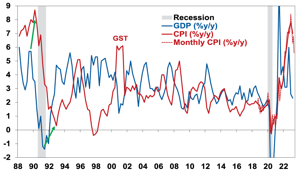
Source: ABS, AMP
While inflation is still too high, the increasing signs of a sharp slowdown in growth and a high risk of recession (which we put at 50% with the biggest risk being RBA overtightening) point to a further sharp fall in inflation as weaker growth means less demand relative to supply in the economy.
Concluding comment
To conclude, the key points are that:
-
Still low unemployment and still high inflation are not that unusual despite slowing growth because they both normally lag big swings in the economic cycle – running the economy with too much focus on them is a bit like driving a car with the rear-view mirror.
-
As such the RBA and other central banks need to tread carefully from here and allow for the lags from the rapid rise in interest rates to work through lest they end up pushing unemployment far higher than they need to in order to return inflation to target. Fortunately, the minutes from the last RBA board meeting suggests it’s aware of the risks.
Source: AMP Capital July 2023
Important note: While every care has been taken in the preparation of this document, AMP Capital Investors Limited (ABN 59 001 777 591, AFSL 232497) and AMP Capital Funds Management Limited (ABN 15 159 557 721, AFSL 426455) make no representations or warranties as to the accuracy or completeness of any statement in it including, without limitation, any forecasts. Past performance is not a reliable indicator of future performance. This document has been prepared for the purpose of providing general information, without taking account of any particular investor’s objectives, financial situation or needs. An investor should, before making any investment decisions, consider the appropriateness of the information in this document, and seek professional advice, having regard to the investor’s objectives, financial situation and needs. This document is solely for the use of the party to whom it is provided.